We are pleased to announce the release of the new version Stimulsoft Reports and Stimulsoft Dashboards 2020.3, which is now available for download. This major release comes with Stimulsoft Dashboards Cloud and Stimulsoft Reports Cloud to design reports and dashboards online on a subscription basis. We have also added new simplified chart editors; ShowNulls, and ShowZeros in charts; a new way of the graphical display of data - Histogram, etc.
Stimulsoft Cloud
We are constantly updating the product line and their pricing policy, so we are pleased to offer you a new solution for creating reports and analytics - the cloud products Stimulsoft Cloud, Stimulsoft Reports Cloud, Stimulsoft Dashboards Cloud. All of these products are available on a monthly or annual subscription and include - cloud storage, tools the reports design, and their preview.
Sign in with Google account
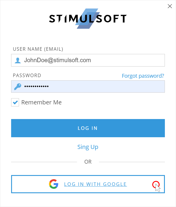
Log in to the report designer, cloud storage, or to your user account using your Google credentials. In the login window, select the Login with Google command and continue to work with Stimulsoft. You can bind or unbind your Google account in the Profile menu.
Page breaks when printing in HTML
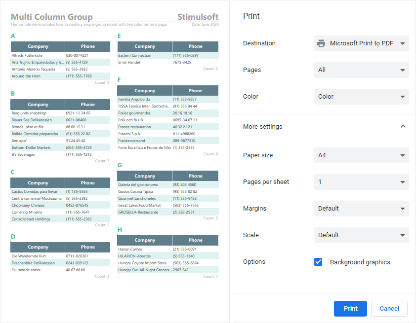
Print the HTML document from the browser taking into account the borders in the report. In the report export settings, enable the Add Page Breaks parameter. As a result, the borders of the report page will be taken into account when printing from the browser for the current HTML document.
Key generation bound to a domain
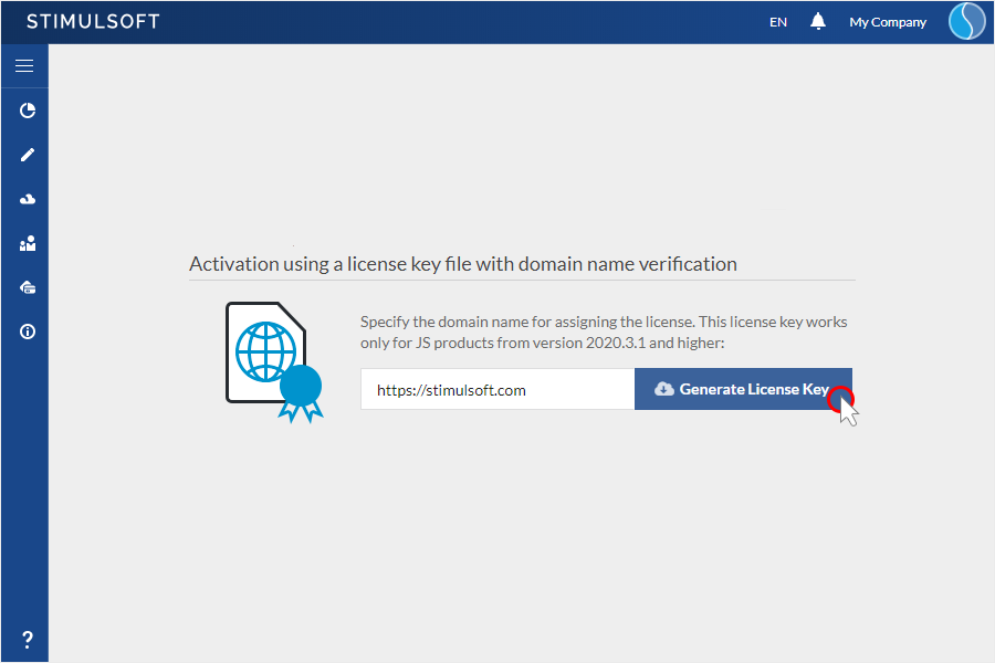
Generate a license key for Reports.JS and Dashboards.JS products and bind it to your domain name. When generating a license key indicating the domain name - this domain name will be encoded and added into the license key code. Thus, the use of this license key on sites with a different domain name will be impossible. You can create such a license key in your user account.
The Histogram chart
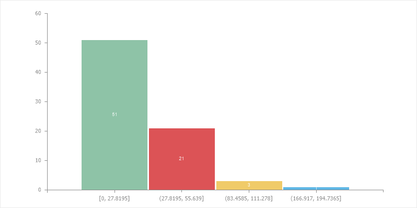
Use the Histogram chart in your reports and dashboards. The histogram can be used to display the number of values in a specific range. Very often, this type of analysis component is used in conjunction with a Pareto chart.
The new Chart editor
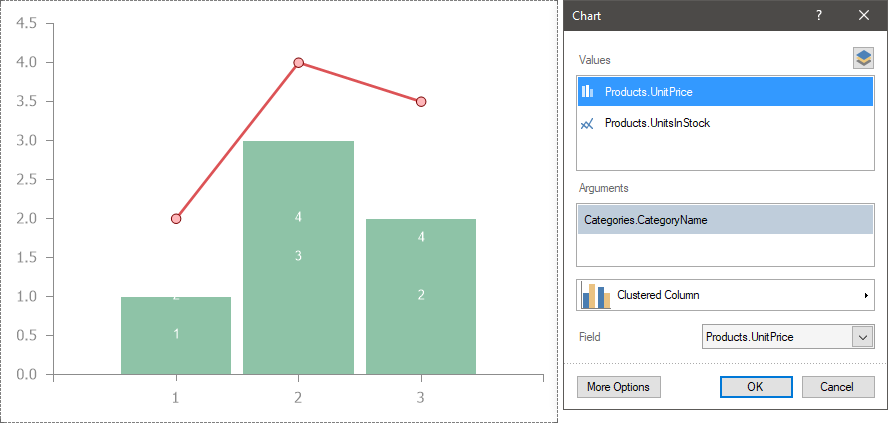
Create charts in reports quickly and easily. In the version 2020.3.1, we added a simple editor for diagrams in reports. Just drag the data columns for the values and arguments of the chart into the editor. If you need to fine-tune the chart component, click the More Options button to go to the advanced Chart editor.
New settings in the Chart editor
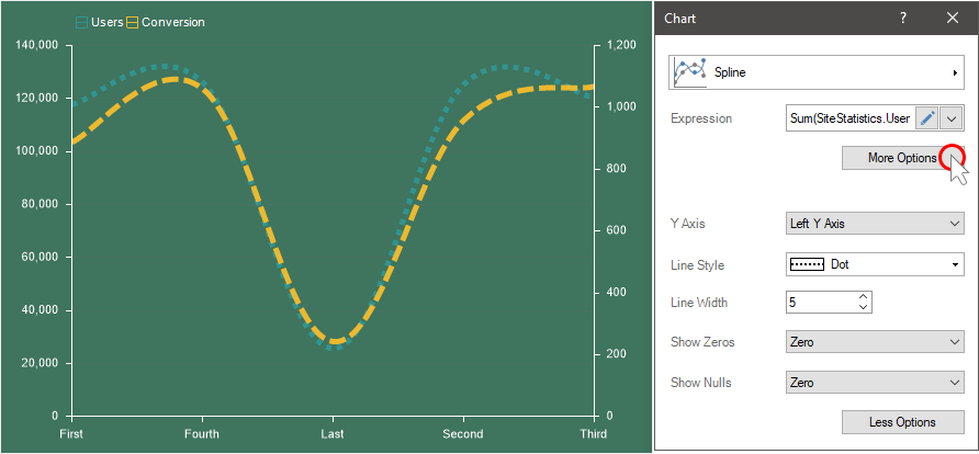
Customize the lines, displaying zero values and null values from the chart editor in the dashboard. To start using these settings, you should click the More Options button in the Chart editor. You can set the thickness, style, and color of the line, how it is bound to the left or right Y-axis, choose the displaying mode of zero values and null values. You should know that the number of parameters in the editor depends on the chart type used. We also added many other properties for customizing charts in dashboard panels. Now you can specify a step for signatures, use additional Y- and X-axes, display or hide extreme values on the X-axis, set up the range of arguments and values, and much more.
Show zeros and nulls
Display zeros and nulls in a dashboard diagram in various ways. You may not display these values, view them as zero values, or unite these values with a line. This allows for more flexible data analysis and trend forecasting. The choice of the display mode of these values is carried out in the chart editor.

Trend lines
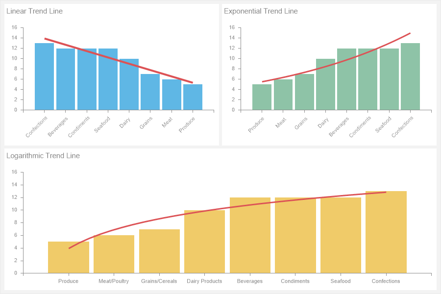
Analyze your data and identify trends in business processes using trend lines. For charts in dashboard panels, you can now add a linear, exponential, logarithmic trend line. Adding and configuring trend lines is carried out in a special editor, which can be called by clicking the Browse button on the property bar of the Trend Line property.
The Doughnut chart width
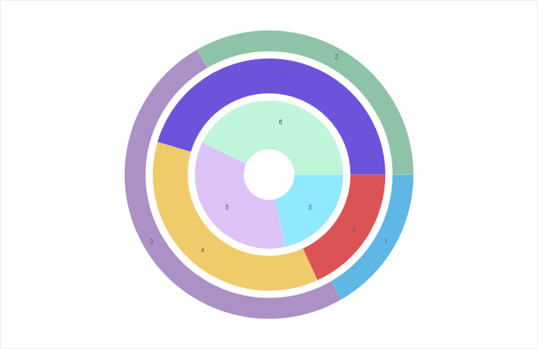
Set up the width of the pie chart series in the reports. In the version 2020.3.1, we added this functionality in the reports. To change the width of a row of a pie chart, you should select the required series in the editor and set the value in the Width property.
Numbering in a table
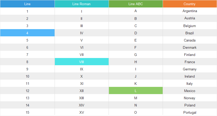
Number the lists in the tables in dashboards. In this release, we have added support for system numbering variables in the Table element. You can use Latin, Arabic, or alphabetic numbering in your tables.
Hyperlinks in text
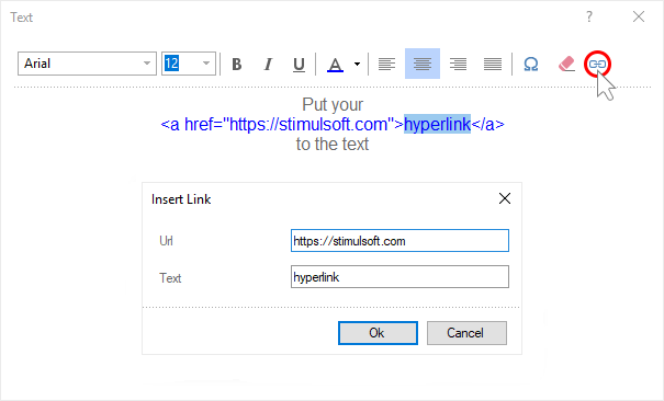
Insert hyperlinks directly into the text. For the Text element in dashboards, we added the functionality to insert a hyperlink. To do this, you should call the text editor and click the Hyperlink button. Indicate the URL address and text for this link.
Operation in filters
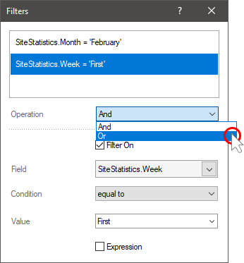
Filter data by multiple data fields with various operations. In the new version 2020.3.1, we have added the ability to define the additional mode to filter conditions for a dashboard element. Previously, all filters worked only with the logical operation OR. Now in the filter editor, you can define the logical operation of adding filtering conditions by setting the logical operation AND or OR.
The new dictionary in a new report
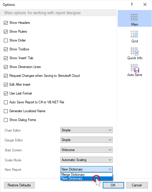
Use the data from the previous report or clear the dictionary. When creating a blank report or an empty dashboard, you can set the mode of creating a new data dictionary. Set the New Report parameter to New Dictionary. Also, you may use the current data dictionary in a new report or dashboard. To do this, set the New Report parameter to the Merge Dictionary value.

Stimulsoft Cloud
We are constantly updating the product line and their pricing policy, so we are pleased to offer you a new solution for creating reports and analytics - the cloud products Stimulsoft Cloud, Stimulsoft Reports Cloud, Stimulsoft Dashboards Cloud. All of these products are available on a monthly or annual subscription and include - cloud storage, tools the reports design, and their preview.

Sign in with Google account
Log in to the report designer, cloud storage, or to your user account using your Google credentials. In the login window, select the Login with Google command and continue to work with Stimulsoft. You can bind or unbind your Google account in the Profile menu.

Page breaks when printing in HTML
Print the HTML document from the browser taking into account the borders in the report. In the report export settings, enable the Add Page Breaks parameter. As a result, the borders of the report page will be taken into account when printing from the browser for the current HTML document.

Key generation bound to a domain
Generate a license key for Reports.JS and Dashboards.JS products and bind it to your domain name. When generating a license key indicating the domain name - this domain name will be encoded and added into the license key code. Thus, the use of this license key on sites with a different domain name will be impossible. You can create such a license key in your user account.

The Histogram chart
Use the Histogram chart in your reports and dashboards. The histogram can be used to display the number of values in a specific range. Very often, this type of analysis component is used in conjunction with a Pareto chart.

The new Chart editor
Create charts in reports quickly and easily. In the version 2020.3.1, we added a simple editor for diagrams in reports. Just drag the data columns for the values and arguments of the chart into the editor. If you need to fine-tune the chart component, click the More Options button to go to the advanced Chart editor.

New settings in the Chart editor
Customize the lines, displaying zero values and null values from the chart editor in the dashboard. To start using these settings, you should click the More Options button in the Chart editor. You can set the thickness, style, and color of the line, how it is bound to the left or right Y-axis, choose the displaying mode of zero values and null values. You should know that the number of parameters in the editor depends on the chart type used. We also added many other properties for customizing charts in dashboard panels. Now you can specify a step for signatures, use additional Y- and X-axes, display or hide extreme values on the X-axis, set up the range of arguments and values, and much more.

Show zeros and nulls
Display zeros and nulls in a dashboard diagram in various ways. You may not display these values, view them as zero values, or unite these values with a line. This allows for more flexible data analysis and trend forecasting. The choice of the display mode of these values is carried out in the chart editor.

Trend lines
Analyze your data and identify trends in business processes using trend lines. For charts in dashboard panels, you can now add a linear, exponential, logarithmic trend line. Adding and configuring trend lines is carried out in a special editor, which can be called by clicking the Browse button on the property bar of the Trend Line property.

The Doughnut chart width
Set up the width of the pie chart series in the reports. In the version 2020.3.1, we added this functionality in the reports. To change the width of a row of a pie chart, you should select the required series in the editor and set the value in the Width property.

Numbering in a table
Number the lists in the tables in dashboards. In this release, we have added support for system numbering variables in the Table element. You can use Latin, Arabic, or alphabetic numbering in your tables.

Hyperlinks in text
Insert hyperlinks directly into the text. For the Text element in dashboards, we added the functionality to insert a hyperlink. To do this, you should call the text editor and click the Hyperlink button. Indicate the URL address and text for this link.

Operation in filters
Filter data by multiple data fields with various operations. In the new version 2020.3.1, we have added the ability to define the additional mode to filter conditions for a dashboard element. Previously, all filters worked only with the logical operation OR. Now in the filter editor, you can define the logical operation of adding filtering conditions by setting the logical operation AND or OR.

The new dictionary in a new report
Use the data from the previous report or clear the dictionary. When creating a blank report or an empty dashboard, you can set the mode of creating a new data dictionary. Set the New Report parameter to New Dictionary. Also, you may use the current data dictionary in a new report or dashboard. To do this, set the New Report parameter to the Merge Dictionary value.
