We are pleased to announce the release of the new version Stimulsoft Reports and Dashboards 2020.2, which is now available for download. This release comes with some updates including optimizations in the Region Map and two new chart types - Waterfall and Sunburst.
Waterfall chart
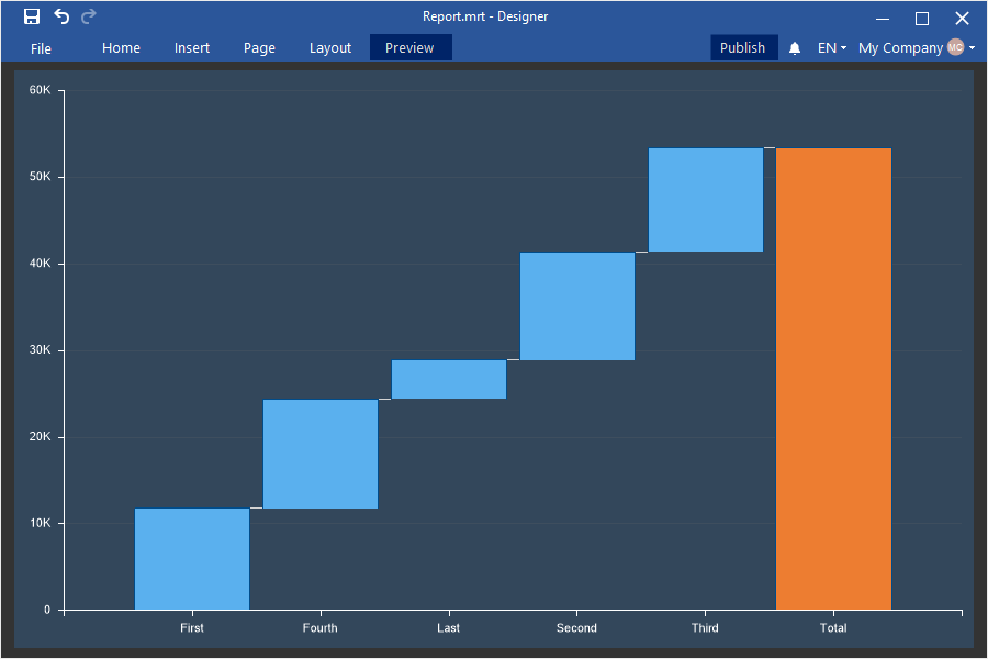
In this release, we have added a new type of chart - Waterfall. Now you can use it to analyze data. A waterfall chart is used to display a running total when you add or remove values.
Sunburst Chart
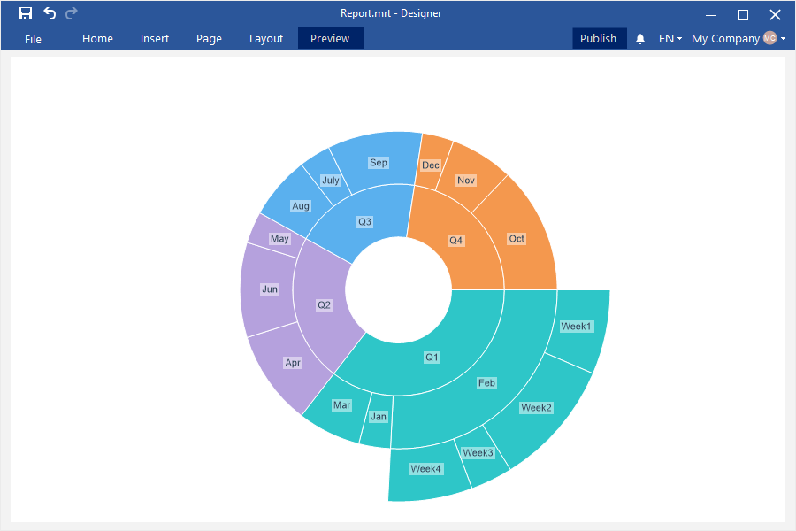
Now you can use the new hierarchical Sunburst chart to design dashboards. Each level of the hierarchy is represented by one ring or circle, and its top is the circle closest to the center.
Scaling of Regional Map
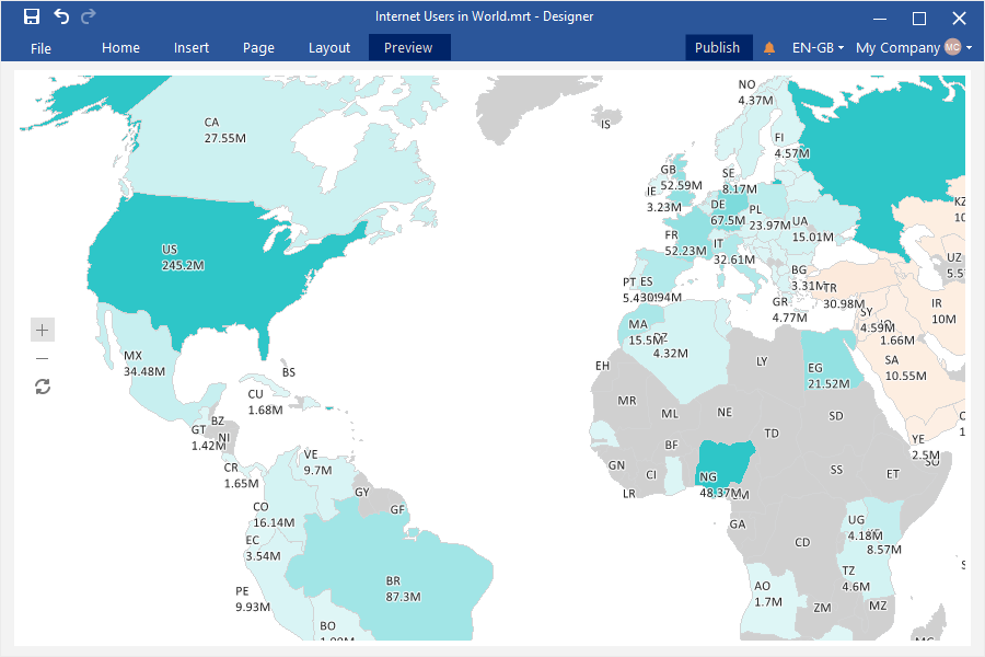
In the new version, we have optimized the Region Map element in dashboards, and also added the ability to scale and drag the map. So now you can focus even on small geographic objects.
Overall result for the Stacked Area chart
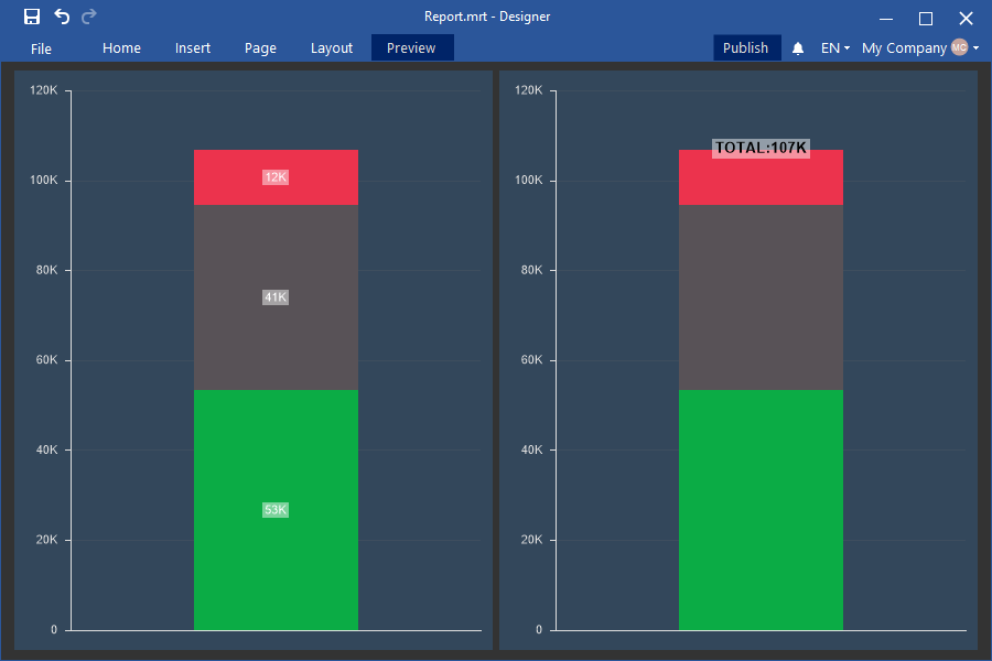
Also, in the current release, we have added the ability to display the total for each argument in the Stacked Area chart of a dashboard. The overall total is the sum of all the values of a specific argument in the chart.
Dark Green theme for dashboards
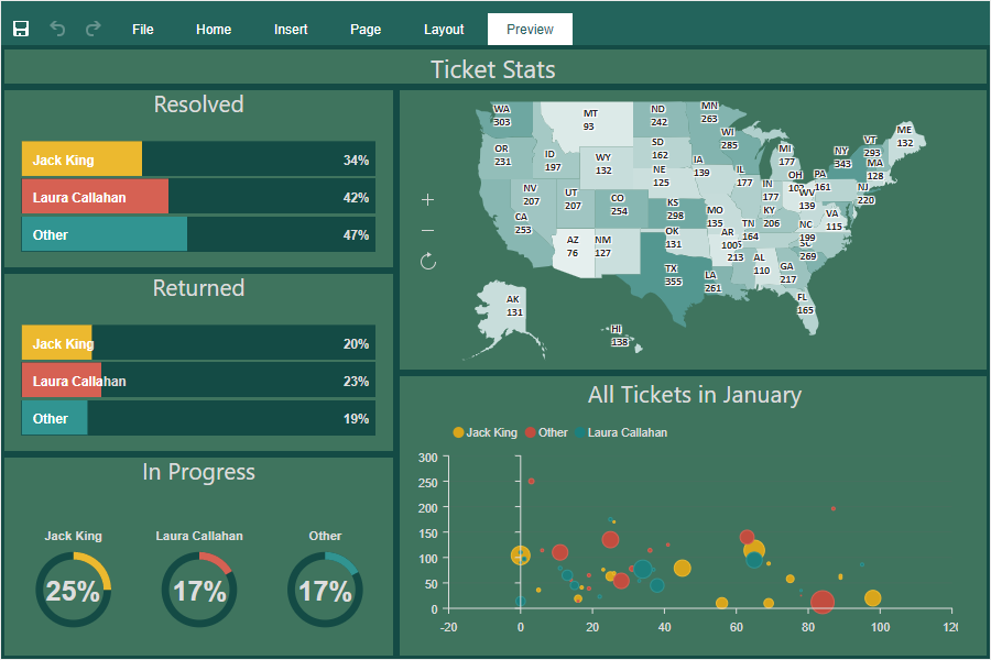
In addition, in the 2020.2 release we added a new theme for the dashboards and its elements. To apply a new style, select the dashboard and select the Dark Green theme from the styles menu.

Waterfall chart
In this release, we have added a new type of chart - Waterfall. Now you can use it to analyze data. A waterfall chart is used to display a running total when you add or remove values.

Sunburst Chart
Now you can use the new hierarchical Sunburst chart to design dashboards. Each level of the hierarchy is represented by one ring or circle, and its top is the circle closest to the center.

Scaling of Regional Map
In the new version, we have optimized the Region Map element in dashboards, and also added the ability to scale and drag the map. So now you can focus even on small geographic objects.

Overall result for the Stacked Area chart
Also, in the current release, we have added the ability to display the total for each argument in the Stacked Area chart of a dashboard. The overall total is the sum of all the values of a specific argument in the chart.

Dark Green theme for dashboards
In addition, in the 2020.2 release we added a new theme for the dashboards and its elements. To apply a new style, select the dashboard and select the Dark Green theme from the styles menu.
