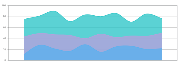
The style of the report affects on how information visually looks in the report. This is especially important when it comes to graphic components. In the 2015.3 release, we have added new styles for data visualization of components such as charts and gauges.
![new styles for charts and gauges 3](/images/news/2015-3/new_styles_for_charts_and_gauges_3.png)
![New Styles for Charts and Gauges New Styles for Charts and Gauges](/images/news/2015-3/new_styles_for_charts_and_gauges_2.png)
![New Styles for Charts and Gauges New Styles for Charts and Gauges](/images/news/2015-3/new_styles_for_charts_and_gauges_1.png)