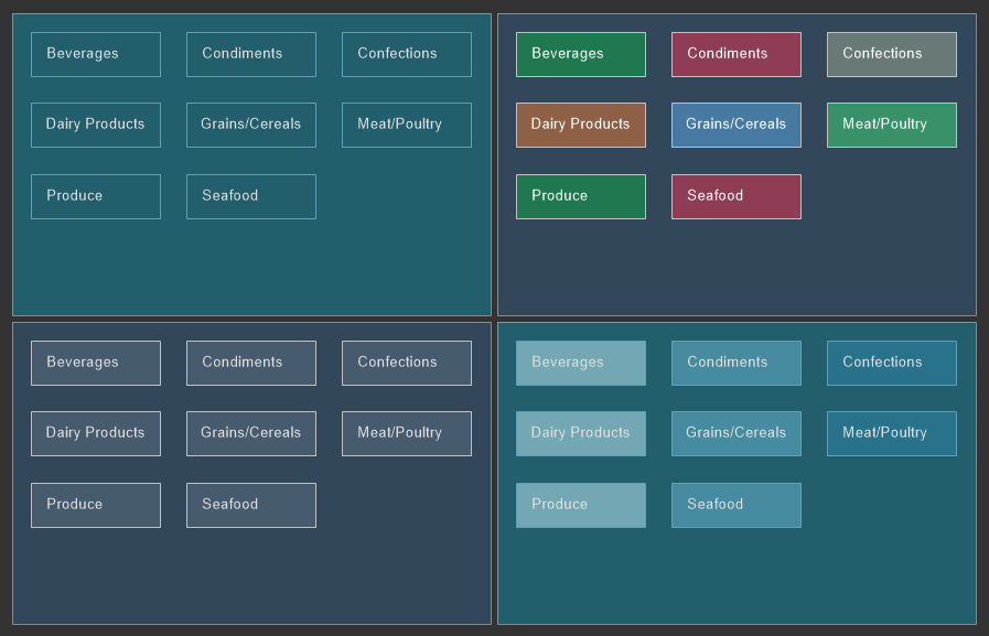
Report Control Style
The Report Control style applies to forms and controls in a report, as well as to filter elements and the Button element in the dashboard. To create a style for a control, you should do the following:
![]() In the style designer, click the Add Style button and select the Report Control style.
In the style designer, click the Add Style button and select the Report Control style.
![]() Use the style properties to customize the formatting.
Use the style properties to customize the formatting.
![]() Apply the style to the report components or dashboard elements.
Apply the style to the report components or dashboard elements.

Information |
It is not possible to edit the preset Report Control styles. However, it is possible to create a custom style based on the preset style and adjust it. To do this, please follow these steps:
|
Below is a list of properties that are used to set the report control style.
Name |
Description |
Name |
Sets the name of the current style. |
Description |
Specifies a description for the current style. |
Collection Name |
Adds an existing style to the style collection or create a new style collection. |
Conditions |
Sets the conditions for conditions for applying the current style if it is included in the styles collection. |
Back Color |
Changes the background color of an element. |
Font |
A group of properties that is used to change the font, its size, and style for the text of controls or filter elements. |
Fore Color |
Changes the text color of the values. |
Glyph Color |
Changes the color of value icons. |
Hot Back Color |
Changes the background color of element values when hovering over in the viewer. |
Hot Fore Color |
Change the text color of the values of the element when the cursor is hovered over the element in the viewer. |
Hot Glyph Color |
Changes the color of the element value icon when the cursor is hovered over the element in the viewer. |
Hot Selected Back Color |
Changes the background color of the element values when this value is selected in the viewer. |
Hot Selected Fore Color |
Changes the text color of the element values when this value is selected in the viewer. |
Hot Selected Glyph Color |
Changes the color of an element value icon when the value is selected in the viewer. |
Selected Back Color |
Changes the background color of an element selected value. |
Selected Fore Color |
Changes the text color of an element selected value. |
Selected Glyph Color |
Changes the icon color of an element highlighted value. |
Separator Color |
Changes the color of an element value separator. |
Allow Use Back Color |
Determines permission to apply a background color from an assigned style or from element properties. If the property is set to True, then the element background fill settings will be derived from the current style. If the current property is set to False, then the background fill settings will be determined by the properties of the element. |
Allow Use Font |
Determines permission to apply a text font from an assigned style or from an element properties. If the property is set to True, then the font settings for the element text will be obtained from the current style. If the current property is set to False, then the font settings for the element text will be determined by the properties of this element. |
Allow Use Fore Color |
Determines permission to apply text color from an assigned style or from an element properties. If the property is set to True, then the element text color settings will be derived from the current style. If the current property is set to False, then the text color settings will be determined by the properties of the element. |