Borders
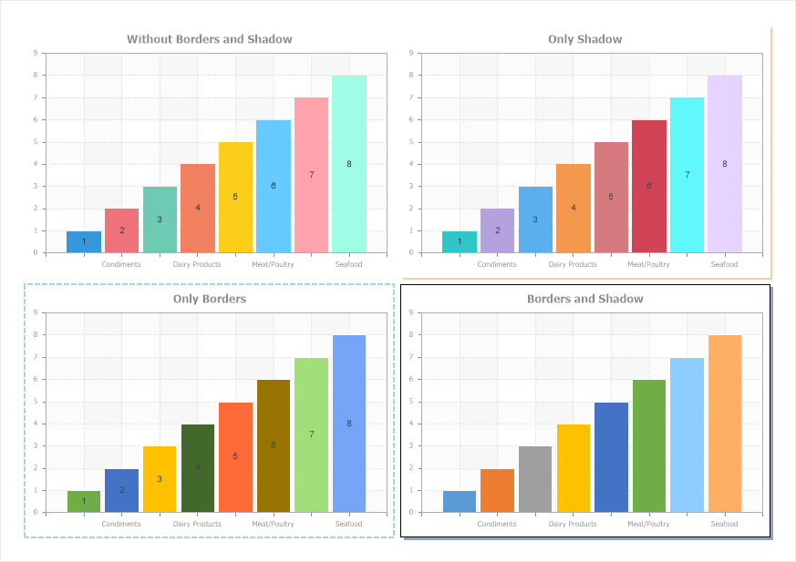
Each component has borders. Since all components in a report are a rectangular area on the page, each component has top, bottom, left and right border. When creating reports, component borders can be displayed or not displayed in a rendered report. Besides, you can display component shadows.

Component borders are set:
![]() Using component properties from the Borders group in the property panel;
Using component properties from the Borders group in the property panel;
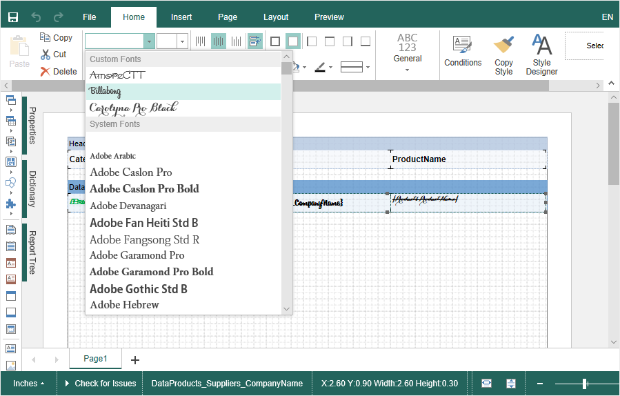
![]() Using commands on the Home tab of the Ribbon panel in the report designer;
Using commands on the Home tab of the Ribbon panel in the report designer;
![]() In the border editor and component shadows.
In the border editor and component shadows.
Component shadow is set:
![]() Using component properties from the Borders group in the property panel;
Using component properties from the Borders group in the property panel;
![]() In the Border editor and component shadow.
In the Border editor and component shadow.
Information |
If the Style is assigned for a component, border settings and component shadows can be taken from this style.
|
To call the border editor and component shadows, you should:
![]() Select a component in a report template;
Select a component in a report template;
![]() Click the Browse button on the Home Ribbon tab of the report designer panel in the Borders settings group.
Click the Browse button on the Home Ribbon tab of the report designer panel in the Borders settings group.
![]() Or click the Browse button for the header of the Borders group in the property panel.
Or click the Browse button for the header of the Borders group in the property panel.
Borders and component shadow editor
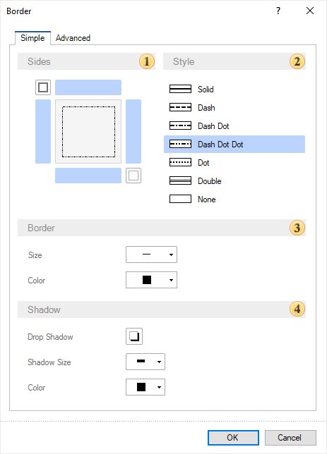
This editor contains the parameters, which allow you to set borders and component shadows of a report. Also, the border and shadow editor contains two tabs:
![]() The Simple, i.e. settings of style, color, and size will be the same for all enabled component borders;
The Simple, i.e. settings of style, color, and size will be the same for all enabled component borders;
![]() The Advanced, i.e. you can define style, color and size for each component border.
The Advanced, i.e. you can define style, color and size for each component border.
You can define a uniform style, color, size for all component borders on the Simple tab.

![]() You can enable or disable the display of a definite component border in the Sides field using controls. Also, there is the button, which allows you to enable all borders and the button for disabling all borders.
You can enable or disable the display of a definite component border in the Sides field using controls. Also, there is the button, which allows you to enable all borders and the button for disabling all borders.
![]() You can change the style of enabled component borders in the Styles field.
You can change the style of enabled component borders in the Styles field.
![]() The Border field contains several parameters:
The Border field contains several parameters:
![]() The Size parameter allows you to change border width;
The Size parameter allows you to change border width;
![]() The Color parameter allows you to change component borders color.
The Color parameter allows you to change component borders color.
![]() The Shadow field contains the parameters of component shadow settings:
The Shadow field contains the parameters of component shadow settings:
![]() The Drop Shadow parameter allows you to enable or disable the display of component shadow.
The Drop Shadow parameter allows you to enable or disable the display of component shadow.
![]() The Shadow Size parameter allows you to change component shadow width;
The Shadow Size parameter allows you to change component shadow width;
![]() The Color parameter allows you to change component shadow color.
The Color parameter allows you to change component shadow color.
Information |
Border size is ignored, if border style is defined as the Double.
|
Examples of component sides borders:
![]()
Examples of different sizes of component borders:

Examples of different border colors:

Examples component shadow:

There is the Browse button on the Advanced tab of the border and component shadow editor, near the control for enabling and disabling the display of component borders. If you click this button, the drop down menu will be displayed, where you can change style, color, size only for the current border.

Also, there are parameters of component shadow setting on this tab.
The example of advanced setting of borders.
