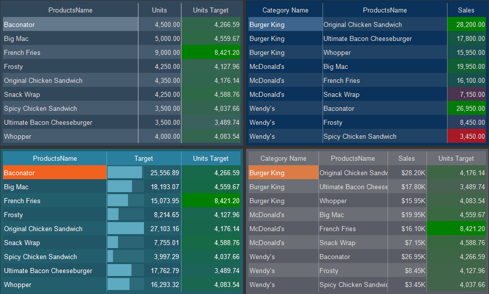
Progress Style
The Progress style is applied to the Progress element. In order to create a progress style, you should:
![]() In the style designer, click the Add Style button and select the Progress style.
In the style designer, click the Add Style button and select the Progress style.
![]() Use the style properties to customize the formatting.
Use the style properties to customize the formatting.
![]() Apply the style to the report components or dashboard elements.
Apply the style to the report components or dashboard elements.

Information |
It is not possible to edit the preset Indicator styles. However, it is possible to create a custom style based on the preset style and adjust it. To do this, please follow these steps:
|
Below is a list of properties that are used to set the progress style.
Name |
Description |
Name |
Sets the name of the current style. |
Description |
Specifies a description for the current style. |
Collection Name |
Adds an existing style to the style collection or create a new style collection. |
Conditions |
Sets the conditions for conditions for applying the current style if it is included in the styles collection. |
Back Color |
Changes the background color of an element. |
Band Color |
Changes the background color of the filled area of a graphical object of an element. |
Fore Color |
Changes the text color of an element. |
Series Color |
Creates a collection of colors that will be used as the background of cards when the Color Each mode is enabled. |
Track Color |
Changes the background color of an empty area of a widget of the element. |